Corrida do Tejo

The context

Following NIKE shoes

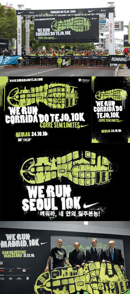
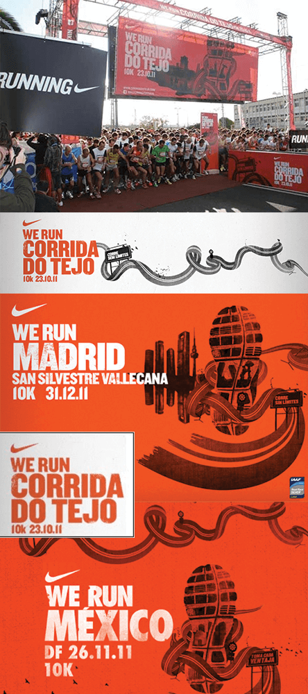
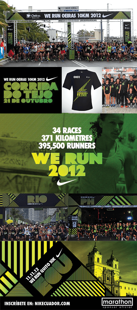
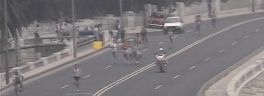
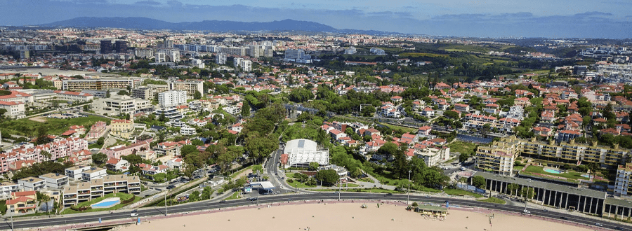
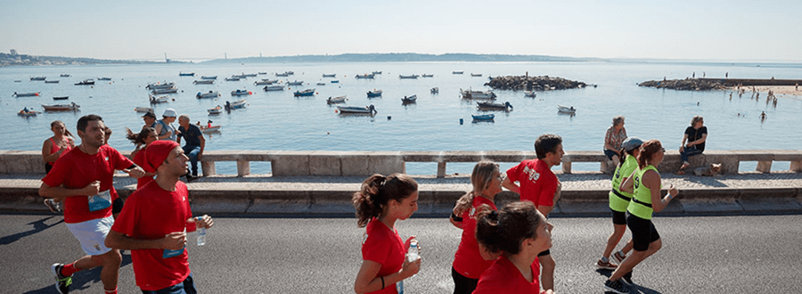
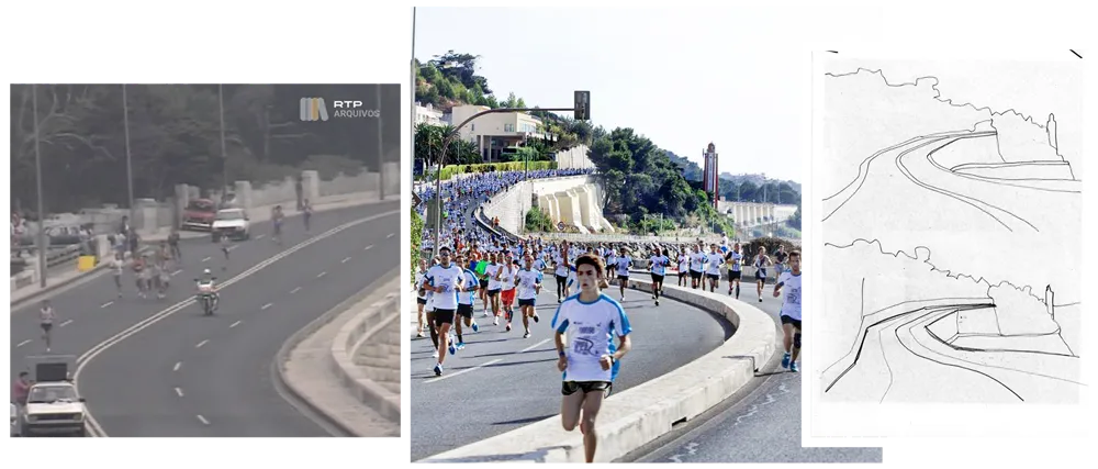
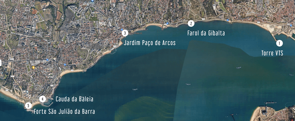
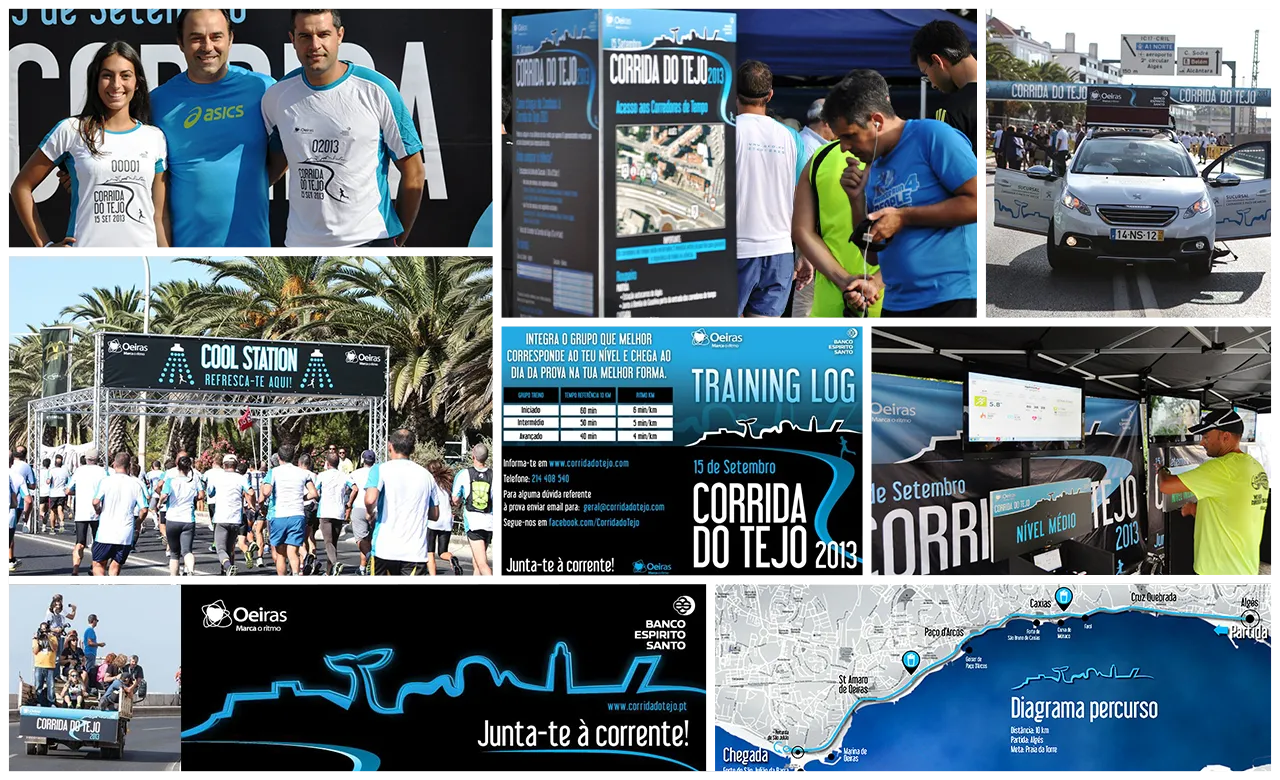
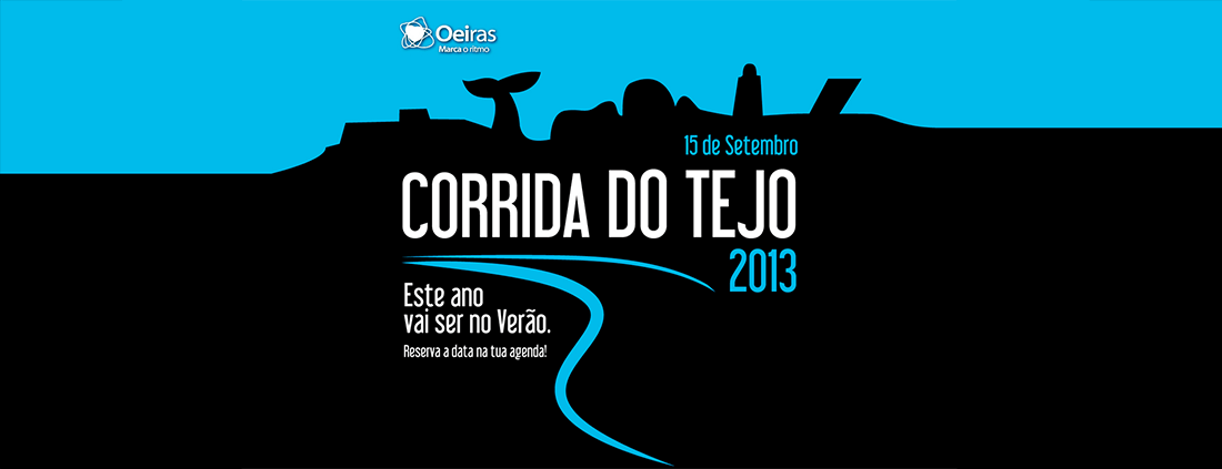
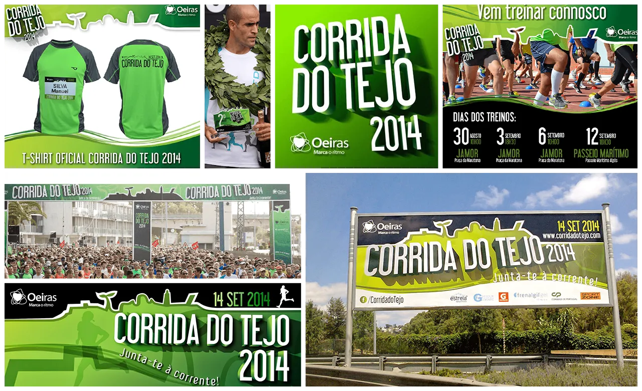
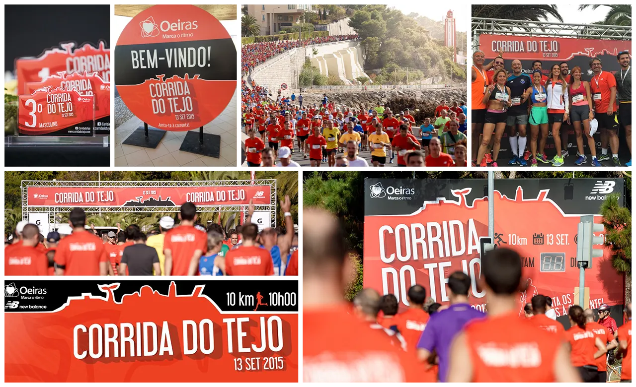
I worked with NIKE Portugal from day one in Last lap, and one of their biggest events was a 10K race in Oeiras: Corrida do Tejo.

They had partnered with Oeiras City Hall for the past 6 years, as main sponsor and co-organizers of the race. During those years, we were working for Nike, managing several parts of the race, but Nike was in charge of creating the visuals.

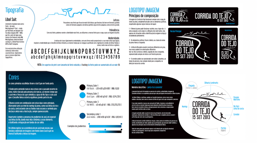
Aligned with their global strategy, every year there was an international visual identity, created for many 10K races around the world like, to name just a few, Madrid, Philadelphia, Seoul, Quito, Rome, etc…

2010

2011

2012

The challenge

In 2013 Nike left the project, and Oeiras City Hall chose Lastlap to be their main event partner. The idea was to continue the growth that a Big Brand had brought to the race with all their Communication and Marketing power. Evidently that was no easy task.

Goals & Insights

From early conversations with Oeiras City Hall, I got to know a little bit better what the scope of this project was, what were its main intents and goals. And they were a little more than “just” creating a new visual to a popular race. Here are the main 3 insights that were established:

New face to an old friend

Corrida do Tejo 1988

During those 6 years, Corrida do Tejo benefited from Nike’s media power and loyal costumer base, as well as an increase of Running popularity in Portugal to raise their participant’s numbers. But this race has been around for 40 years now (2021), and had  a loyal fan base of veteran runners (and some local running teams) that have always given this race a solid participant’s base.

So the “new face” had to appeal to those “Old costumers”.

Promoting the promoter

Another very important thing to try to incorporate into the design, was the client. In this case: Oeiras city Hall.

Corida to Tejo was theirs, and they were our client. And for them,  promoting a 10k race was not only promoting sport activity for their population, but served also as greeting card for Oeiras. Having a major sports brand as partner takes a lot of the limelight, and they wanted the spotlight back.

Running with the river

Finally, we tried to find out what distinguished Corrida do Tejo from so many others in the country? What made it stand the test of time and be so popular?

Did some research on runners’ feedback about participating in the race, and the answer was crystal clear: The beauty of the course itself. The breathtaking views that runners have, from run alongside the river for more than 70% of the 10Km were, by far, the most important race feature mentioned. It was, quite frankly, emblematic.

Design solution

I started my design process armed with those insights and gathering feedback from the client every step of the way. I tackled it from the runner’s point of view. Maybe without even realizing it, I was already focusing on User Experience…

User's point of view

I realized the importance of the Tejo in this race, because people were running with the river, but it was the course itself that was “like a river”, curvy and sinuous, so identifiable to everyone. Looking at media coverage of the race, I noticed they always picked a particular spot of the race for their hero shot (you can see it also in the TV’s coverage from the 1980s), so it was incorporated in my design.

But I turned the POV back to the runners, setting them at the start of the race, Algés, heading to the finish line. 

There's politics everywhere.

Well, runners weren’t only running alongside the river. They were also going through Oeiras many landmarks and beautiful locations, that I tried to incorporate in the design as a silhouette. It was intended to serve as graphic elements to be used in a variety of pieces of communication and branding, but also to convey the message of city hall investment in some specific areas of territorial management, such as:

Historical & Cultural Landmarks
Sports & Recreation
Environment & Ecology
Technology & Business Center

So I picked 5 Landmarks to represent each development area.

They were distributed along the course of the race,  from start to finish, as  any potential participant would see them when looking at the course map.

The logo

Armed with those insights and gathering feedback from the client along the way, I created the main logo, along with colors, fonts and graphic guidelines.

This was the final approved stand-alone logo design, and the typography and colour scheme for Corrida do Tejo 2013. 

Application

Because we were creating a hole visual identity for the race, there was, from the start, the intention of using many of the different graphic elements of the logo (and colour pallet) to create multiple variations of the visual identity through many formats: physical and digital.

Here are just some examples of the many different use of the Race’s visuals throughout a plethora of communication and branding supports.

Evolution

Every year the race visuals suffered a refresh, so we could accommodate new sponsors (particularly Main Sponsors), or, at the very least, we could change the race jersey’s colour. Those changes ranged from just colour scheme to lettering and naming overhauls.

I only worked on the first 3 years of it: 2013, 2014 and 2015. In 2016, Lastlap created a totally new logo and visual identity for the race.

Here are some images of the 2014\2015 visuals, where we the race naming gain a bigger presence with a 3D dimension and shadows. We lost the curves of the racecourse and river, and the runner  became a graphic element present in just selected pieces. We kept the very distinctive silhouette, present in almost every branding piece.

2014

2015