Conversion Rate Optimization
Helping out a friend
A small workout session for my inner Ux Designer.
With all I’ve learned about UX during this past 2 years, while trying to get into this business, one thing became very clear to me:
Everyone is looking for experienced professionals.
Well, that’s something I aspire to acquire (excuse my poetry).
So, when I realized a friend of mine had a UX problem, I jumped at the opportunity to put my knowledge to the test in a real case.
Note:
In this case, I will focus more on my thought-process and approach to this UX situation, than on the final outcome.
Evangelizing UX
I had some friends over for dinner, and this friend of mine, Javi, was telling me about his projects. He told me he was working with Guillermina de Bedoya, a dance teacher who gave dance lessons in her studio in Madrid. They decided to sell her courses and classes online, and he was in charge of web design and video content.
I told him I was a UX designer, and it sparked a conversation about good\bad UX practices. When I mentioned the UX writing workshop I did, and the importance of good UX copy, he asked if I would be able to help him out with something.
What's the problem?
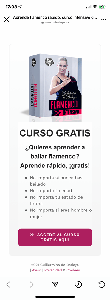
Well, they promote her services in her social media platforms, and use them to drive traffic to her site. One way they do this, is by giving out a free Flamenco online course in her Instagram, so people can try it out for free.
He showed me the Instagram account on his phone, and I followed the link to that free course. I immediately started pointing ways to improve it, and UX design flaws. So, when told me that most people were leaving the page without registering, I was not surprised.
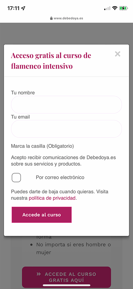
I told him we could improve it by redesigning and re-writing only two screens: the landing page and the register pop up. That was it!

Setting goals
I wanted to understand their business proposition to set my goal and approach.
Before I changed any content or copy, I needed to understand the stakeholder’s priorities and main objectives.
What was more important for them? Getting one more free course subscription, or marketing the paid courses? Was the main goal increasing newsletter subscribers or registered free course users? Depending on their intents, I would make “editorial decisions” myself.
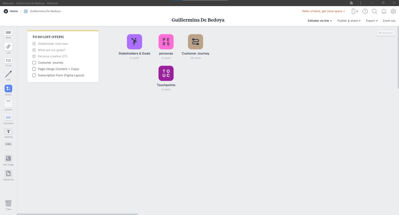
To keep track of everything, I created a Milanote board and gave Javi full control also. That way, we both could add information, and he could even correct my notes if I got something wrong.
Stakeholder interview
So I decided to have a Zoom meeting with Javi. That way, I could ask him about everything, and we could talk about the steps needed to get to a solution.
From that conversation I got to know their business, learn about who were the stakeholders (Javi and Guillermina), and set the goals.
Services and touchpoints
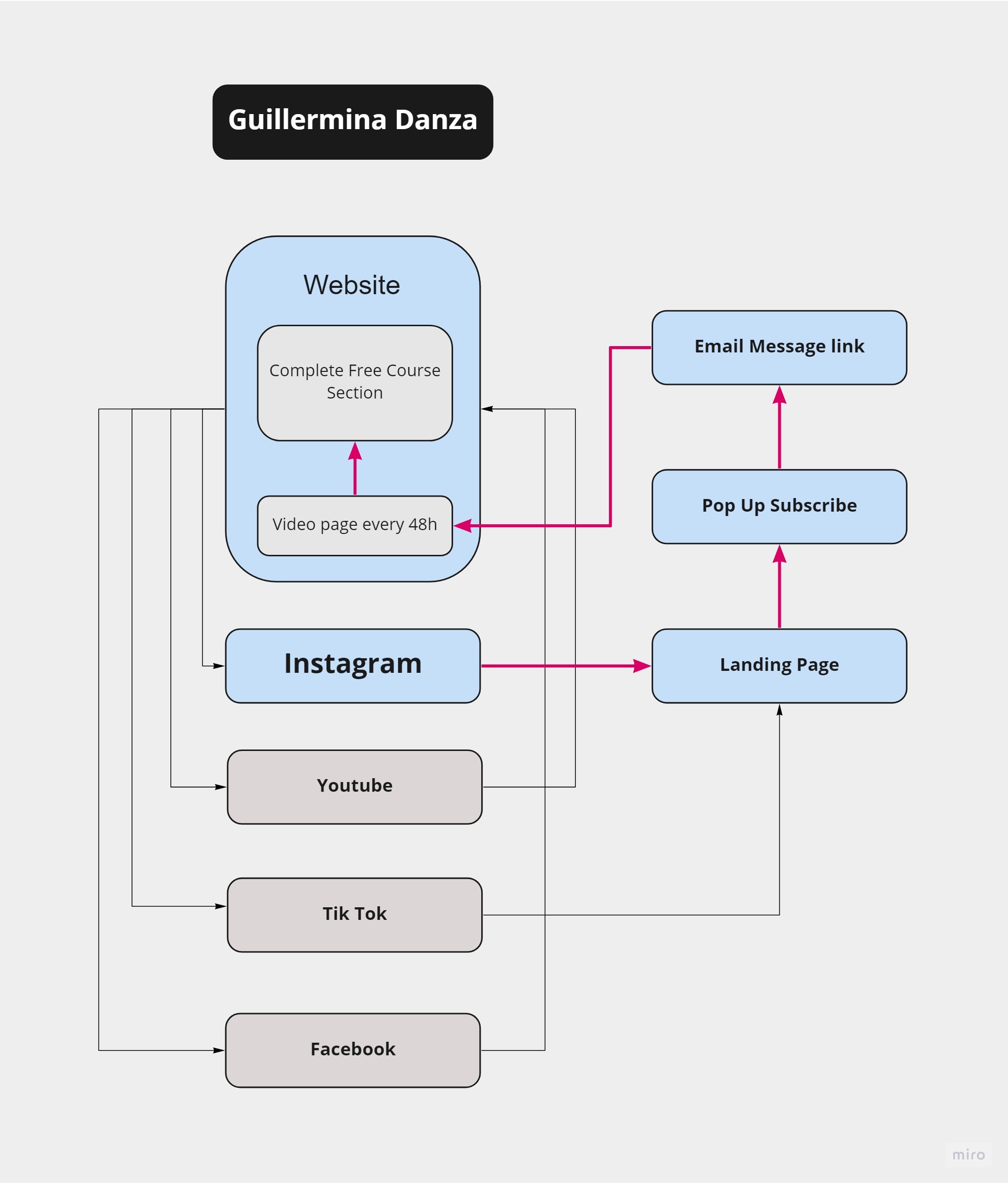
Another thing I wanted to know, was about the register flow. What happened after users submitted their registration? How did they get access to the lessons? I needed to know what users could expect, so I could use it later on.
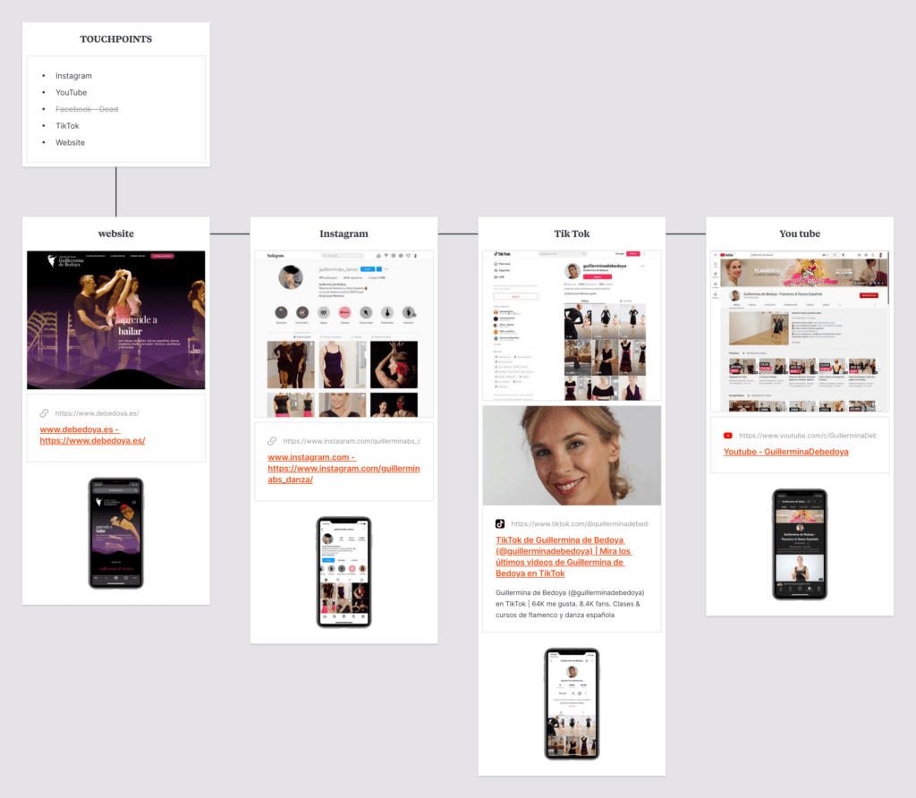
I was also looked at all their touchpoints, because I wanted to see if the approach to users and the content of their posts was consistent across all platforms.
Las Personas
Finally, I asked him for as much information about their users he could give me. This was crucial because it would help me decide on page contents, but also to choose the right Tone of voice.
The vast majority were women, with a fair amount of purchasing power and adult to middle-aged (between 30-something and 60-ish). But, there was a split in users between a couple of key characteristics:
Language: Latin America\Spanish and International\English
Computer Literacy: some very savvy, other not so much.
Available time: not working\retired and still mid-career.
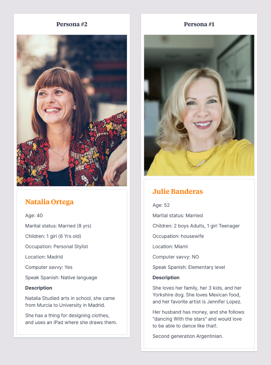
With his input, we decided to create 2 personas, distributing them among the two:
Looking for insights
My goal was to improve the registering flow from social media up to register button.
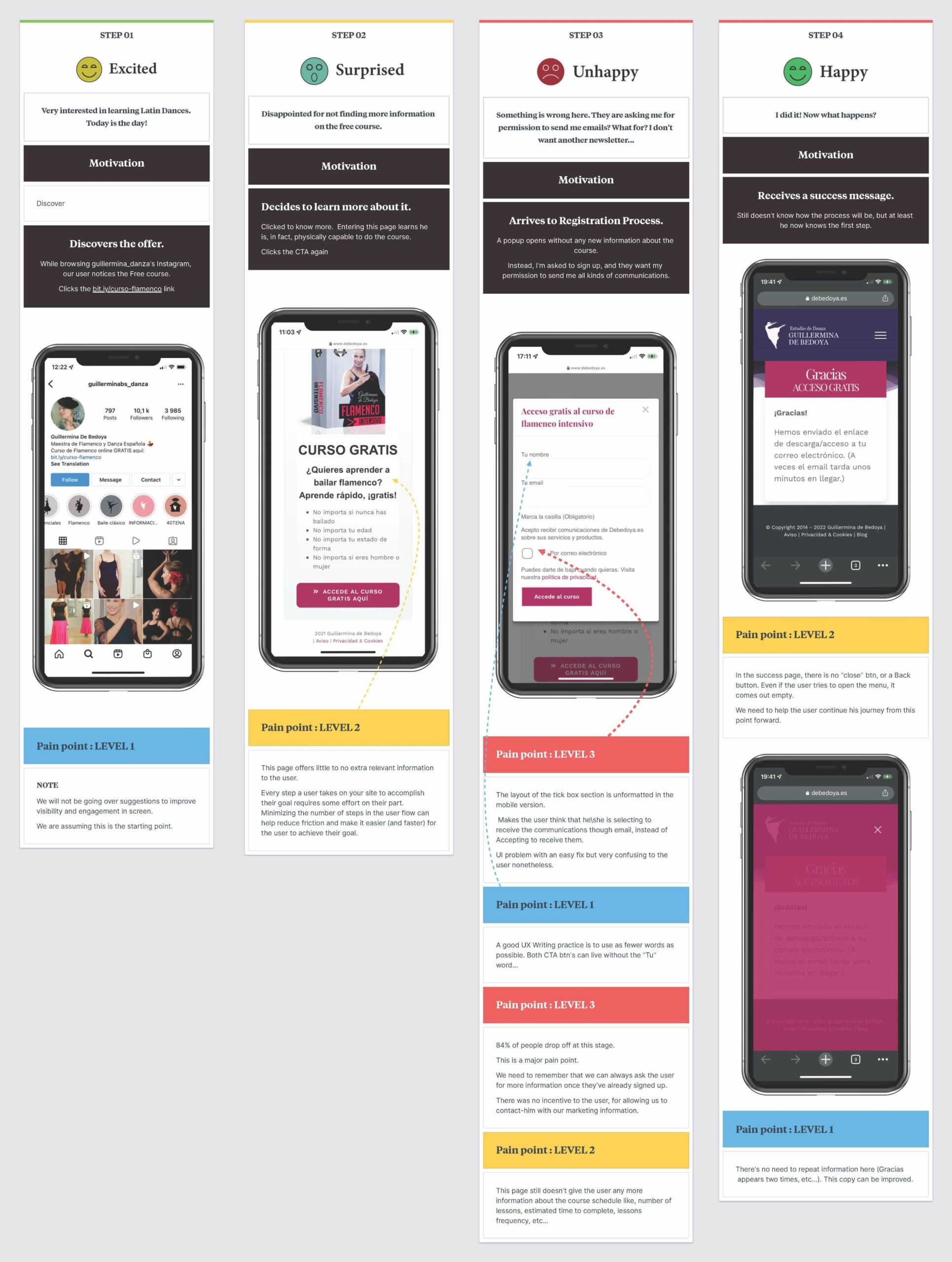
So I had to create the customer journey, to try and identify pain points and opportunities. I already had my own first impressions, and from that I gathered there was room to improve.
Apart from obvious design issues, I also thought UX writing was not ideal but, most of all, as a user, I needed more information to push me to register.
Finally, I realized I had to study the costumer’s journey through mobile devices. Mobile first is a good design principle in itself, but in this case even more so, because Instagram was the starting point of the journey.
Mobile first
I noticed many UI design flaws in mobile screen’s version of the Desktop version. And most of them were a noticeable result of a desktop oriented design.
Same font sizes in both devices, stacking issues with modular containers, same paragraph leading and tracking on text, just to name a few.
Stepping of my shoes
So I had many insights, design critiques and ideas to start, but realized something: I was miles away from our personas.
I needed to test this with someone else, ideally women over 40. To such a small personal project, I resorted to the best thing I had access to: My wife and her friend (both over 40).
So I asked both to go through Guillermina’s Instagram and follow the link. I used screen recording to save video of their actions, and later asked them what were their thoughts.
Their feedback matched my first impressions, and were similar enough to allow me to start creating the journey.
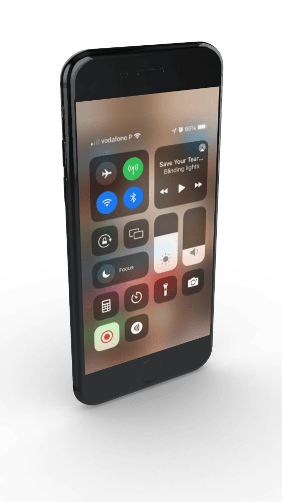
Customer journey
I started the journey as a follower of Guillermina’s Instagram. Then I saw a free Flamenco Online Course promotion and decided to click the link in a bio.
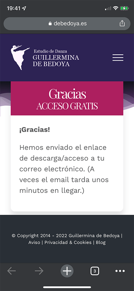
I was focuses on the next 2 screens, a landing page and then a registering pop-up. To follow the user’s registration process, I had to sign up myself, with I did.
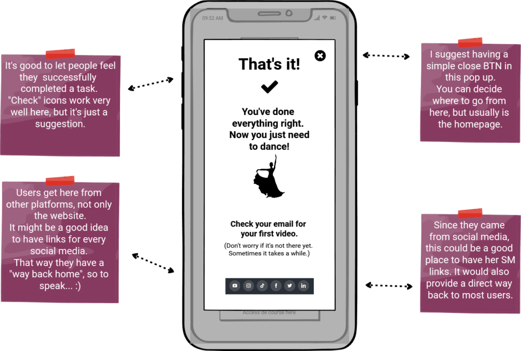
That led me to the success screen, and once arrived there, I had another “not-so-great experience” of not knowing how to get out of there. So, I decided to work on it too.
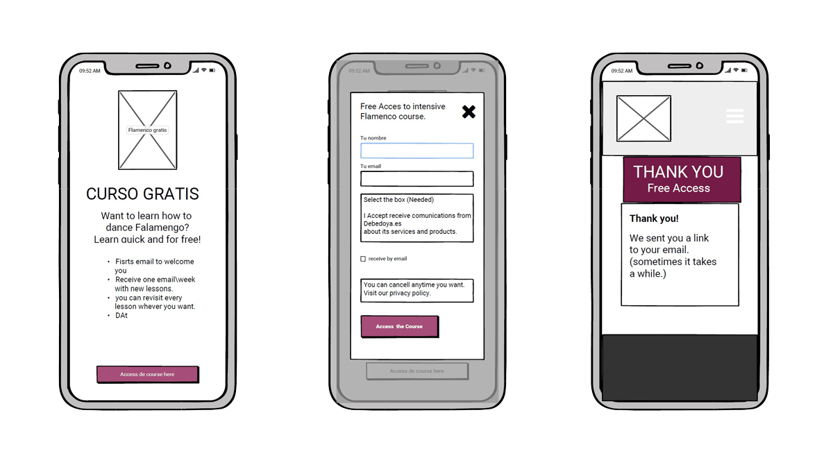
Wireframing
I learned about Balsamiq through a job offer where the company asked for experience working with it. It was a skill I didn’t even knew existed. So I decided to find out what it was. I discovered it’s a very cool wireframing tool, so I decided to use it.
As usual, the perfect way to learn a skill is to work with it. This project, although very small, was enough to get familiar with it.
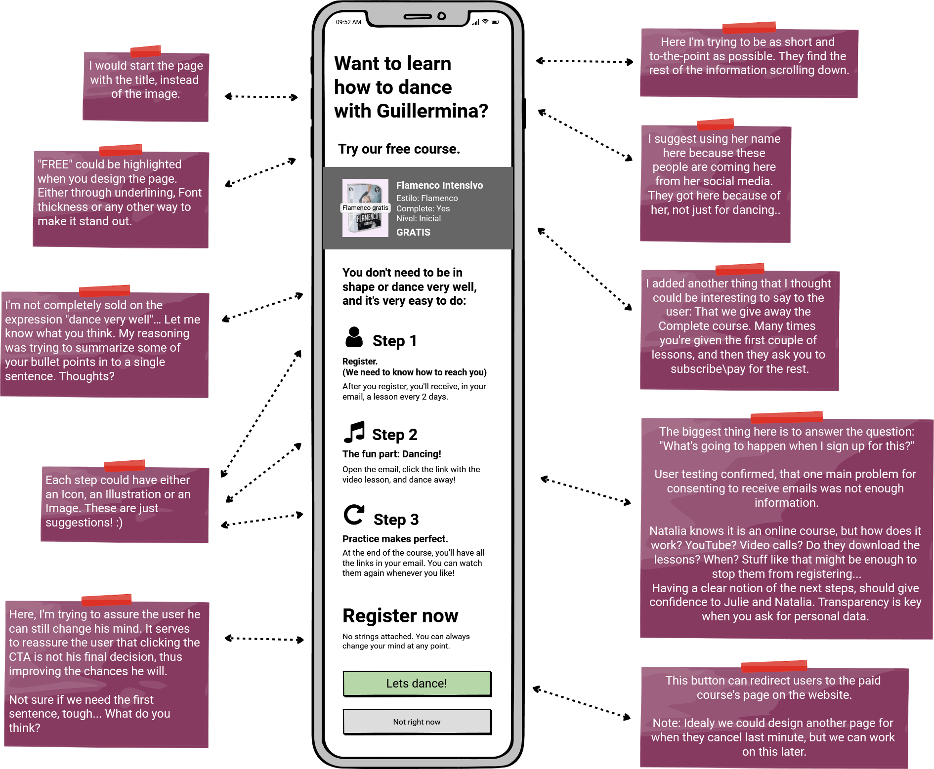
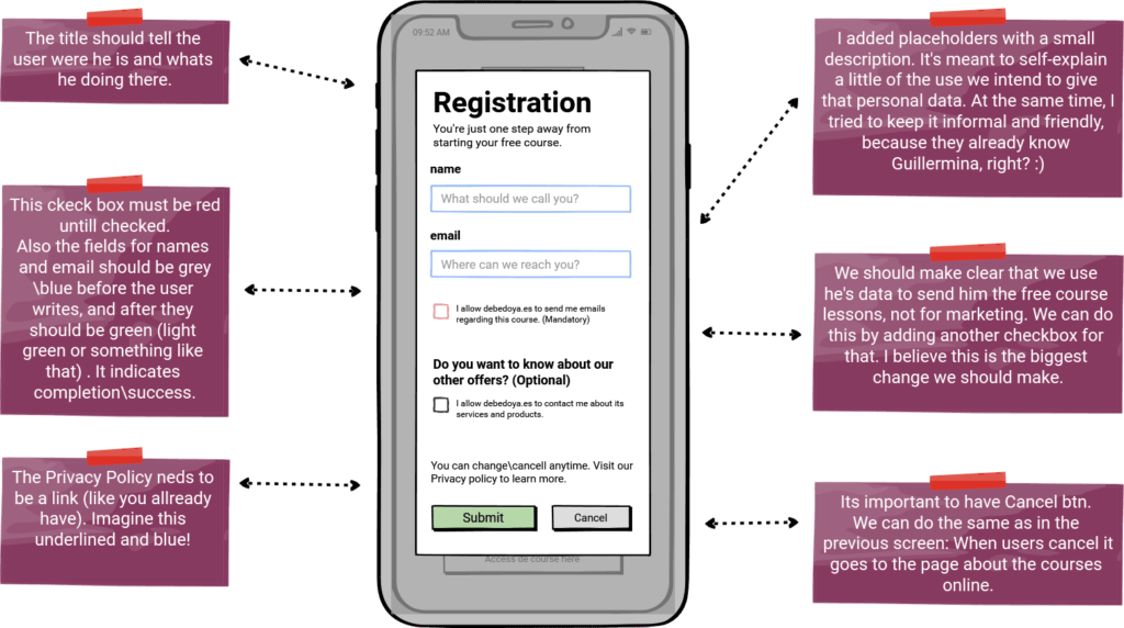
So I created the wireframes of the 3 screens to serve as references: Landing page, Pop-up and Success.
My insights
After gathering all the “Intel”, I needed to build my solution, for all 3 screens. And I had a list of insights for each of them:
- Page header
- Start with a Title instead of the image.
- Re-write the Title as a question.
- Add information about the process after registering.
- Make it short, few steps and short copy with clear benefits.
- CTA
- Reduce text label and make it one line only.
- Change color: for a positive action, we should avoid a color so close to red.
- Bullet points start with “no importa” too many times. Change this copy.
- Text hierarchy is missing.
- Text fields:
- Improve on the input area’s label. Remove “your”.
- Using stroke color, we should help the user know where to write. Use greens and blues. Red is for errors only.
- Personal Data Consent:
- Create 2 tick-boxes: One for this free course only, and another for newsletter\MKT\etc…
- Fix the layout. The tick box is underneath the copy and email is after.
- CTA:
- Change color. Again: we should avoid red as much as possible.
- Add a “cancel” btn
Landing page
- Page header
- Start with a Title instead of the image.
- Re-write the Title as a question.
- Add information about the process after registering.
- Make it short, few steps and short copy with clear benefits.
- CTA
- Reduce text label and make it one line only.
- Change color: for a positive action, we should avoid a color so close to red.
- Bullet points start with “no importa” too many times. Change this copy.
Register Pop-up
- Text hierarchy is missing.
- Text fields:
- Improve on the input area’s label. Remove “your”.
- Using stroke color, we should help the user know where to write. Use greens and blues. Red is for errors only.
- Personal Data Consent:
- Create 2 tick-boxes: One for this free course only, and another for newsletter\MKT\etc…
- Fix the layout. The tick box is underneath the copy and email is after.
- CTA:
- Change color. Again: we should avoid red as much as possible.
- Add a “cancel” btn
Designing
So I started to design the screens with my insights in mind, and built them with notes to Javi. I wanted him to know the reasoning behind my design choices, so he could way in, with he’s perspective. After all, he is the Stakeholder and developer too, so he’s feedback is important.
Landing page
Giving user's more information about the process.
When I clicked on the Instagram link the first time, I remember my first impression of the landing page:
Why am here? There is no point on having this extra-step if there was no new information for me.
So, this was the first thing I tackled when I started working on this screen. The question was:
How to give users more information, keeping the existing useful “selling points”, without overloading the user?
Also, I wanted to break the content apart in 3 sections: Course info, next steps and Call to action. I wanted to create rhythm and progression all the way to the register btn.
Register Pop-up
Explaining why we need user's data.
From what I’ve gathered during research, user’s don’t want to subscribe to another newsletter, they want to receive the free course. There’s a reward there.
Getting something for free, is the 3rd more common reason to subscribe. Before that comes “Learn about a topic” and “Stay up-to-date on latest content”.
But Natalia and Julie are Social media followers, and there is no better way to do it than through social media.
So we need to make clear we need their data to be able to give them the free course.
Success page
Congrats and a way out.
In this screen, I focused mostly on editing the copy, and mainly showing the way out to user’s. There was no reason why users should be trapped in this stage. We want to leave on a nice note.
Also, we should re-direct them to social media, where Guillermina’s promotion tactics have evidently worked with this user.
Testing, testing...
Measuring success was another big thing I wanted to do after all the design changes. I was very curious and excited to test the efficacy of my ideas, but we had to find a starting point to measure against. It was an opportunity to learn some more about Google Analytics, so I got to increase my understanding of user metrics.
Like I said in the preface, for the purposes of this Case study presentation, I don’t want to focus too much on the actual results of the design change.
Not because I don’t want to show a failed attempt, or some other personal related reason. Design thinking is a circular process, and testing and iterating are crucial parts of good UX Design.
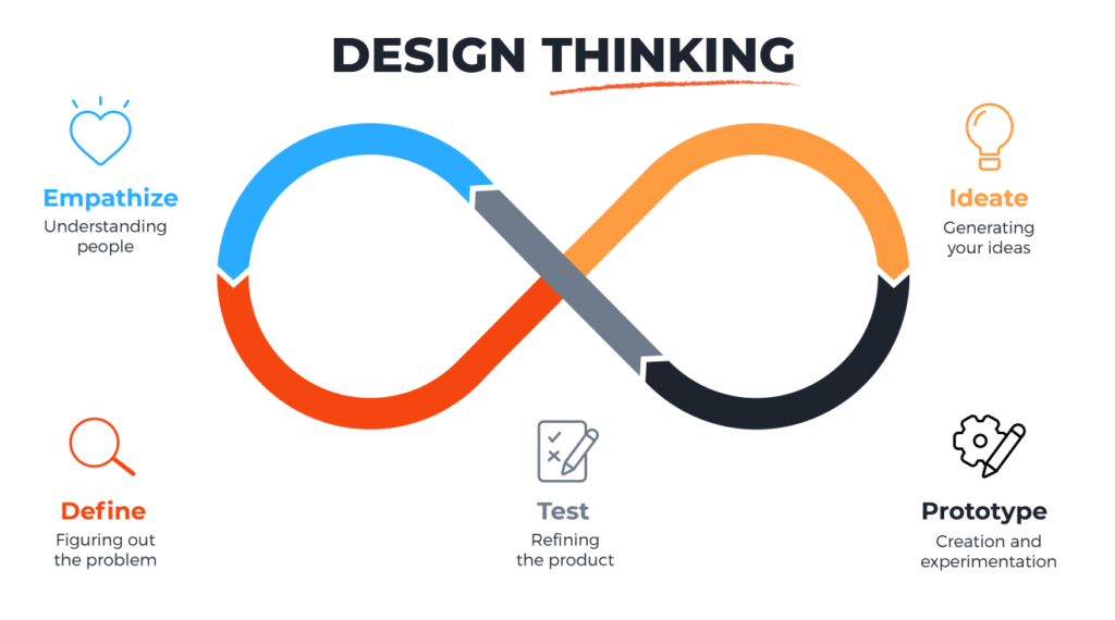
I just wanted to show my design approach and describe the best I can my thought process along the way. Another big reason is to be able to put it up online right now, without having to wait enough time going by to see the conversion rate changes.
Lessons
What did I take away from this experience?
The first big take away from this was the value of testing.
What works for you might not work for the persona. It’s really so much about being able to know what the pain points are.
The second is iteration. I pretty much came up with a solution and executed it. While I’m writing this, I’ve already spotted lots of smalls mistakes, or things I want to change…
Much like UX Writing, were we take 1 hour writing and 6 hours editing the text, Ux is all about testing the solutions we design.
Finally, I’d have to say I realized how big a deal is to know the hole journey, and especially how users get to where we are.
Knowing our two personas were coming from social media was crucial in determining both the writing and the content of all 3 pages.
NOTE:
I’ll try to update this case study with real results as I get them.
