Designing a Form
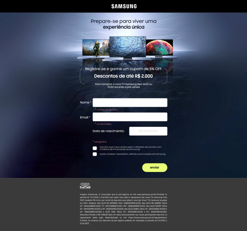
I was asked to design a simple page with a small form for Samsung.
Samsung Brazil was a big client form us and they were staring to ask us small UX projects, along the regular Rich media campaigns we already did for them.
Desktop First
The Briefing was simple:
This would be the end lead of a campaign Samsung was launching with a discount coupon.
We needed to design the LP and collect the participant’s data.
The 2 main challenges were:
This would be the end lead of a campaign Samsung was launching with a discount coupon.
We needed to design the LP and collect the participant’s data.
The 2 main challenges were:
1 – Lack of assets (we had no photoshop file, just a Background Jpeg. To be able to use it in a desktop version, I had to create as bigger background image first.
2 – It was a first time working with this client, and they were (still are) “Desktop First”, I had to start pushing for Mobile first Design from day one..
My main design ideas were:
1 . Clean separation between the campaign information\Kv and the Form itself.
2 . Organizing fields vertically.
3 . Using success colors in submit Cta.
4 . I had to fight for the Newsletter tick box default state to be “inactive”.
5 . Client wanted to ask for “age” and “State”, I asked for as little information request as possible.
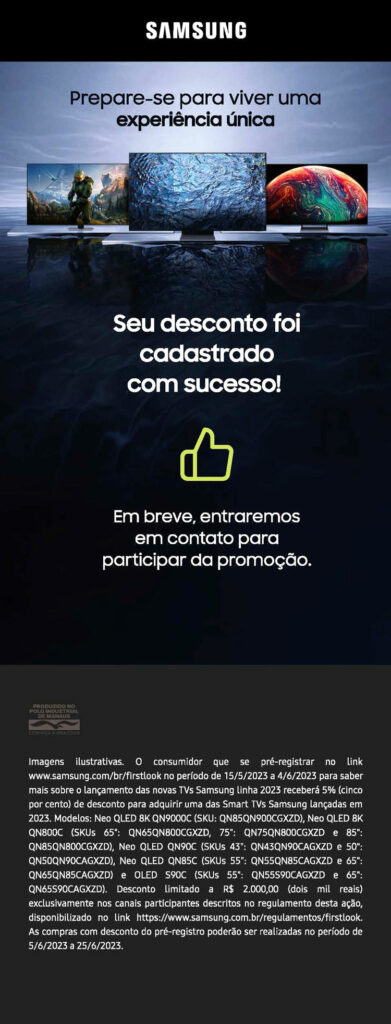
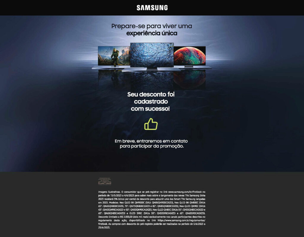
Success page
My main design ideas were:
1 . Clean separation between the campaign information\Kv and the Form itself.
2 . Organizing fields vertically.
3 . Using success colors in submit Cta.
4 . I had to fight for the Newsletter tick box default state to be “inactive”.
5 . Client wanted to ask for “age” and “State”, I asked for as little information request as possible.


